


Search
Log in
 Dailymotion
 Google Video
Who is online?
In total there is 1 user online :: 0 Registered, 0 Hidden and 1 Guest None
Most users ever online was 243 on Thu May 27, 2021 2:56 pm
Latest topics
 feeds
feeds
Reviews
3 posters
Page 1 of 1
![]()
 Reviews
![]() by Survivor of Violence Thu Jul 12, 2012 5:16 am
by Survivor of Violence Thu Jul 12, 2012 5:16 am
Devil on my ShoulderFour usergroups, three of which are staff. I'll break into this quickly - the chat mods group is not needed. In fact, you can simply chatmod someone on the chat without them having to be in a moderating group. I went and looked around the usergroups and found you actually have an administrator in your moderators group, which means you have 2 admins and 1 mod. (Remove the admin from the mods group.) Whilst this number of staff (three without chat mods) is fine for a forum with this activity, I feel that the site could actually see days of further activity, which could thus prompt you to get more staff.
The most users you had online were 70. However, you have much less than this number registered, showing that a lot of them must have been guests. If this was the case, then you've certainly been doing very well in your social networking. The effort shown in this part however, is not reflected in the forum's actual activity. For example, you had 6/31 users online in the last 24 hours. I accept that many of the members may already have left, but if this has truly happened, alarm bells should be ringing. Try and find out why they left if you can, and address any issues they may be having. Your site genre is quite niche, but that shouldn't stop you from hosting some competitions or tournaments that could increase activity.
In terms of the number of posts you have, the ratio of posts to members is at the moment, is 148. (4595 messages, 31 members) This is massive, but you cleaned out your memberlist recently didn't you? If not, then ignore that comment and take this as a sign of very high activity, which you should be happy about. My main concern again, is not the activity your current members are showing, but rather the number of members you have. Such a low number is not sustainable, and requires even more networking to get members to join. If you find getting members to join is an issue, then look over the forum and its posts, and check for any spam topics or things with swears that could potentially turn others off from joining.
In all, the site looks fine and activity from members looks fine. It is by no means terrible at this point, just a tad low. Try to get more to join and show their activity so it could even quadruple. Happy musicing!


comment.
Last edited by Survivor of Violence on Sun Jul 29, 2012 6:36 pm; edited 1 time in total

Survivor of Violence- Admin

- Posts : 3693
Age : 37
Join date : 2011-12-18
Gender : Location : State of the Union
 -

![]()
![]()
Re: Reviews
![]() by Splasher Thu Jul 12, 2012 7:24 am
by Splasher Thu Jul 12, 2012 7:24 am
They mentioned me :')
I agree with what they said, we need more members!
I agree with what they said, we need more members!

Splasher- Admin
- Posts : 1087
Age : 104
Join date : 2012-01-17
Gender : Location : Australia
![]()
![]()
Re: Reviews
![]() by Survivor of Violence Thu Jul 12, 2012 7:35 am
by Survivor of Violence Thu Jul 12, 2012 7:35 am
ahhhhhh :8):I feel that the site could actually see days of further activity
Survivor of Violence- Admin
- Posts : 3693
Age : 37
Join date : 2011-12-18
Gender : Location : State of the Union -
![]()
![]()
Re: Reviews
![]() by Survivor of Violence Sun Jul 29, 2012 6:37 pm
by Survivor of Violence Sun Jul 29, 2012 6:37 pm
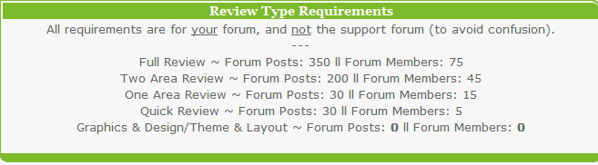
next review: Two Area Review. 4 more users to go to get this point
Survivor of Violence- Admin
- Posts : 3693
Age : 37
Join date : 2011-12-18
Gender : Location : State of the Union -
![]()
![]()
Splasher- Admin
- Posts : 1087
Age : 104
Join date : 2012-01-17
Gender : Location : Australia
![]()
![]()
Re: Reviews
![]() by Survivor of Violence Mon Jul 30, 2012 2:34 am
by Survivor of Violence Mon Jul 30, 2012 2:34 am
no, we had only Quick Review (with the old skin) but it was positive.
Survivor of Violence- Admin
- Posts : 3693
Age : 37
Join date : 2011-12-18
Gender : Location : State of the Union -
![]()
![]()
Re: Reviews
![]() by Survivor of Violence Tue Aug 28, 2012 7:12 pm
by Survivor of Violence Tue Aug 28, 2012 7:12 pm
so guys, let me know which one i should ask for for our Two Area Review:
Graphical & Design/Theme & Layout - Description: The graphics of you're forum and it's overall design put into a short summary of about one paragraph.
Generalities & Activity - Description: This aspect involves looking over at the how many staff/user groups there are, the staff/user activity, the number of messages posted on the forum and number of users on the forum.
Originality & Special Features - Description: When you request Originality as a review, the reviewer will describe what's unique about your forum, and what isn't. The reviewer will also provide ideas that can make your forum unique in more ways than one, all in one short paragraph.
Survivor of Violence- Admin
- Posts : 3693
Age : 37
Join date : 2011-12-18
Gender : Location : State of the Union -
![]()
![]()
Re: Reviews
![]() by Leonie Wed Aug 29, 2012 3:54 am
by Leonie Wed Aug 29, 2012 3:54 am
last one seems good. In my opinion.Survivor of Violence wrote:so guys, let me know which one i should ask for for our Two Area Review:Graphical & Design/Theme & Layout - Description: The graphics of you're forum and it's overall design put into a short summary of about one paragraph.
Generalities & Activity - Description: This aspect involves looking over at the how many staff/user groups there are, the staff/user activity, the number of messages posted on the forum and number of users on the forum.
Originality & Special Features - Description: When you request Originality as a review, the reviewer will describe what's unique about your forum, and what isn't. The reviewer will also provide ideas that can make your forum unique in more ways than one, all in one short paragraph.

Leonie- Admin
- Posts : 2726
Age : 28
Join date : 2012-01-02
Gender : Location : Germany -
![]()
![]()
Re: Reviews
![]() by Splasher Thu Aug 30, 2012 9:44 am
by Splasher Thu Aug 30, 2012 9:44 am
I'd say the first one (it would be nice to know what they think  ) or the last one
) or the last one
Splasher- Admin
- Posts : 1087
Age : 104
Join date : 2012-01-17
Gender : Location : Australia
![]()
![]()
Re: Reviews
![]() by Survivor of Violence Thu Aug 30, 2012 10:15 am
by Survivor of Violence Thu Aug 30, 2012 10:15 am
okay then, let it be the first one and the last one 
Survivor of Violence- Admin
- Posts : 3693
Age : 37
Join date : 2011-12-18
Gender : Location : State of the Union -
![]()
![]()
Re: Reviews
![]() by Survivor of Violence Tue Sep 04, 2012 9:22 am
by Survivor of Violence Tue Sep 04, 2012 9:22 am

Devil on my Shoulder
Graphics and Layout
Banner (Score: 9/10)
The banner looked absolutely brilliant, matching the entire forum's premise. What really bugged me though was the forum description being present. I'd remove the description (just remove it in the admin panel below where the name appears in the customization options, this will only apply the removal to the forum's appearance and not for those who search up the forum.) If the description was removed, then the entire banner would look much cleaner.
Navigation Bar (Score: 4/5)
The navbar looks like it should be very good, but the space between the navbar and the banner kills it a bit. Try to find out how you can remove this banner and this will help the illusion of the navbar being what it is - a dripping... thing xD
Post & Forum Icons (Score: 3/5)
I feel the icons are rather plain. Where you have
 to represent a new post, I think this would really benefit from being more flashy. For instance, if you have the original image .psd, then the green could encompass more of the image. Where you have three small dots to show a popular topic, this could be a large orange blob instead. This is just my opinion because otherwise, the images look uniform and perfectly fine. They just aren't very eye-catching.
Background (Score: 3/5)
The plain grey background matches well with the theme. However, what I found a bit jarring was the transition of white to the grey, particularly in the forum corners at the top left, top right, bottom left and bottom right. There is a border rounding code available on this support forum, and I feel the site would really benefit from it.
In terms of the background image itself, it is quite plain. If you want to attract more attention to it, you could put a very faint pattern on it (squares, lines, your choice) in a similar shade of grey to what you already have.
Other Forum Images (Score: N/A)
You don't seem to have any other images, and the lack of these shows in your otherwise word-filled widgets. Try to make some images to spruce these up, if you can.
Theme (Score: 10/10)
The whole forum seems like a whole, not a mish-mash of random images, which is great. I like how you've managed to make the site coherent, and seeing as I haven't seen any of these images before, the theme could also be deemed unique.
Forum/Category Layout & Organization (Score: 6/10)
This is probably the weakest part of the site. I know NOTHING about music (I'm deaf) but your site is about three bands, basically. Why then, do you need a fourth forum about 'the big three' when there is hardly anything to say (it seems) in terms of their 'connections' and 'differences'?
Additionally, you do not seem to have descriptions for each forum, notably live shows and meetings, and blogs. I would merge the Off topic, General Chat and Entertainment boards, putting some as subforums to different forums where possible (disable the links from showing in the structure and hierarchy part of the admin panel if this is an issue). This will help the site look more compact and active rather than spread out.
Score: 34/50
Special Features & Originality
Special Features & Originality
Widgets (Score: 2/5)
The widgets are clean and carefully-implemented, but they are merely the basic forumotion ones. I'd suggest trying to put in unique ones such as a music player (playing music legally, of course) and an image gallery for the musicians, or whatever you like.
Notable/Unique Design & Coding Features (Score: 2/10)
I couldn't actually find anything original or special in terms of the site design and coding, which is rather sad. Nonetheless, this means there is plenty of potential for the site. I give you a 2 because your posting avatars are on the right instead of the left, which appears to be the norm these days.
Additions I'd suggest include:
- Remove underline of links on hover
- Maybe a banner than plays a bit of music if you mouse over (gently panning in and out)
Other than this, have a play around and see what your members like. Don't add a feature if it has the potential to be annoying, but do add one if it helps the forum look cooler (without being annoying).
Design & Coding Extras (Score: 2/5)
I didn't see any dynamic navigation bars, glow codes nor a colour picker. Whilst I know why you don't have a colour picker, it may be nice for those who think grey is a bit boring. Additionally, have a look at how you can make your navigation bar a bit more dynamic. Perhaps you could include flashing text on 'register', or a glow on the text of 'log in' once hovered over?
As it stands, there isn't really anything obvious that sets the forum apart from others, sorry. This is still a very good improvement from since I did the last review though! Keep it up and rock on!
Score: 6/20
Last edited by Survivor of Violence on Tue Sep 04, 2012 5:51 pm; edited 1 time in total
Survivor of Violence- Admin
- Posts : 3693
Age : 37
Join date : 2011-12-18
Gender : Location : State of the Union -
![]()
![]()
Re: Reviews
![]() by Splasher Tue Sep 04, 2012 11:07 am
by Splasher Tue Sep 04, 2012 11:07 am
They love the banner  I agree with the navbar looking like it's dripping out of the banner. That was my intention but it didn't know how to make it work. I also agree that we should get rid of the "Big Three" sub-forum.
For the other review, I think an image gallery of the bands would be awesome, and we could put all photos posted in the respective picture threads in it. Also, a music player would be cool (using Spotify or another legal player), we could put up the newest single/song by one of the bands or have a song of the week. I don't think we should worry about making stuff like Log In glow when you put your mouse over it for now, we should get the more important things done first
I'd edit this stuff myself but I'm terrible with coding
I agree with the navbar looking like it's dripping out of the banner. That was my intention but it didn't know how to make it work. I also agree that we should get rid of the "Big Three" sub-forum.For the other review, I think an image gallery of the bands would be awesome, and we could put all photos posted in the respective picture threads in it. Also, a music player would be cool (using Spotify or another legal player), we could put up the newest single/song by one of the bands or have a song of the week.
I don't think we should worry about making stuff like Log In glow when you put your mouse over it for now, we should get the more important things done first I'd edit this stuff myself but I'm terrible with coding
Splasher- Admin
- Posts : 1087
Age : 104
Join date : 2012-01-17
Gender : Location : Australia
![]()
![]()
Re: Reviews
![]() by Leonie Tue Sep 04, 2012 11:21 am
by Leonie Tue Sep 04, 2012 11:21 am
I agree with Jesse. A Song of the week bla bla would be awesome!
Leonie- Admin
- Posts : 2726
Age : 28
Join date : 2012-01-02
Gender : Location : Germany -
![]()
![]()
Re: Reviews
![]() by Survivor of Violence Tue Sep 04, 2012 4:10 pm
by Survivor of Violence Tue Sep 04, 2012 4:10 pm
Splasher wrote:They love the banner
For the other review, I think an image gallery of the bands would be awesome, and we could put all photos posted in the respective picture threads in it. Also, a music player would be cool (using Spotify or another legal player), we could put up the newest single/song by one of the bands or have a song of the week.
I'd edit this stuff myself but I'm terrible with coding
glad you like the review but trust me Jess, i'm worse with coding. i prefer using template codes to be honest haha
Survivor of Violence- Admin
- Posts : 3693
Age : 37
Join date : 2011-12-18
Gender : Location : State of the Union -
![]()
![]()
Re: Reviews
![]() by Survivor of Violence Tue Sep 04, 2012 5:52 pm
by Survivor of Violence Tue Sep 04, 2012 5:52 pm
the song of the week stuff is a really good idea. damn, i need to speed up first 
Survivor of Violence- Admin
- Posts : 3693
Age : 37
Join date : 2011-12-18
Gender : Location : State of the Union -
![]()
![]()
![]()
Page 1 of 1
Permissions in this forum:
You cannot reply to topics in this forum|
|
|
» Upcoming Shows You're Going To
» News Update
» Frank Turner & The Sleeping Souls/Million Dead/Möngöl Hörde
» Now I'm Listening To...
» Happy Birthday to LEO!!!
» Well, Someone's old
» Valentines Day
» Tattoos and Piercings
» For The Mods only